Market Alert Pro provides a variety of searches that return lists of trade candidates. Some of these searches return lists of trending stocks. Having a list is convenient, but a trader might want to know how to choose between a list of stocks which are all trending up.
There are several metrics we can use to differentiate trade candidates. We can use volatility, liquidity, market sector and whether the stock is a blue chip or more speculative stock. Let’s look at some examples charts and rank them. There is no right or wrong here because each trader will have an opinion as to the best opportunity. However, we can suggest some basic criteria that are likely to improve profitability.
Firstly, a stock needs to be liquid enough to allow your proposed trade size to be traded on any given day. This is usually a volume issue. If a trader is considering a $10k trade, the stock would have to trade a reasonable multiple of $10k worth of shares daily. That multiple might be at least 10x. So, a $1 stock would have to trade at least $100k or 100,000 shares each day for the past, say, 50 days. This would provide a level of confidence that the traders position could be purchased and sold again. Turnover is a variation on volume. Turnover is simply the share price x the volume to give a dollar value traded each day. Either method is acceptable to measure liquidity. Also, the stock should not show more than one or two zero volume days in its recent history. Ideally, it would have no zero volume days.
Volatility is very much a chart visualisation method of assessing a stock’s performance. What we are looking for is a stock that shows a consistent upward trend in price over a six or twelve-month period (for longer term traders) and that the short-term swings in price are less than say 10% in magnitude. This is important because a trader may be considering a 10% stop loss. Regardless of the size of the stop loss, a trader needs to know that the stocks regular oscillations are less in percentage terms than the stop loss being set. If the stock regularly swings more than the traders stop loss, the trade is likely to be closed early resulting in a loss that could have been avoided.
Blue chip stocks occupy higher positions in a market index. For example, stocks in the S&P 100 rank higher than stocks in the S&P 500 (but not the S&P100). In other words, higher market capitalisation stocks occupy progressively smaller watchlists within a market. For example, the Australian market offers lists for the ASX20, ASX50, ASX100, ASX200, ASX300 and the All Ordinaries 500. The higher the index, the shorter the list of higher market capitalisation stocks. This means we have a means to rank stocks whose charts appear very similar. If there is nothing else separating two stocks, a trader might choose an ASX100 stock over a stock that is in the general population of ASX shares and does not appear in nay of the abovementioned watchlists. Market Alert Pro provides this information in its stock lists.
Now let’s look at some charts that present similar profiles and look at how to differentiate them.
Market sector is a very broad measure of a stocks potential. Essentially, a trader will look at sector performance and ascertain if a stock of interest is in a growth sector. This is not something we can see in a stock chart though.
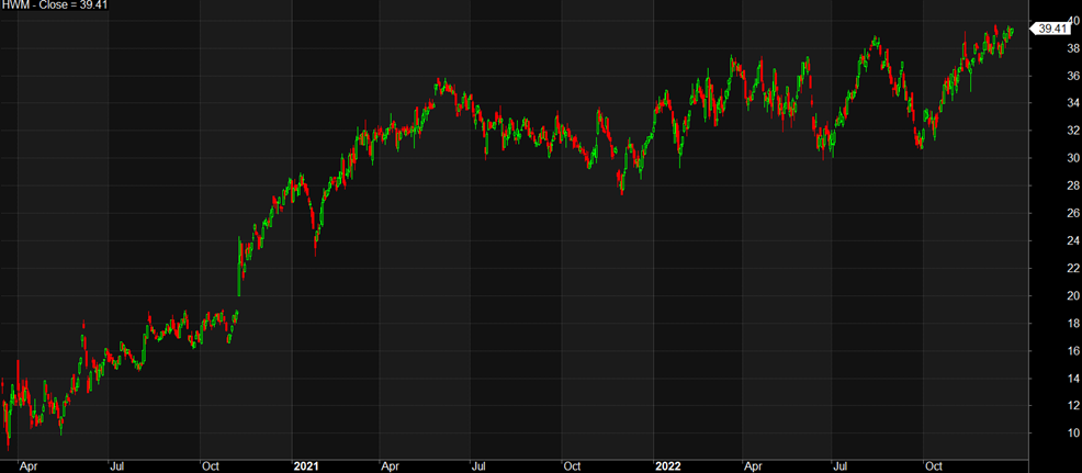
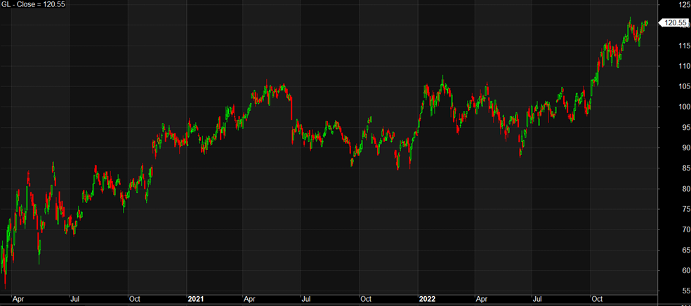
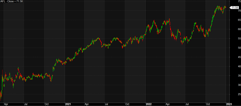
On the following page are three charts: AFL, GL and HWM which are all S&P500 stocks. GL and AFL are Financials Sector stocks, while HWM is an Industrial. 3-year performance of these sectors is similar at 6% and 8% growth respectively. All three stocks show adequate volume to be liquid stocks. Where they differ, is in their price performance and the percentage price appreciation over the term of the chart. GL has appreciated from approx. $60 to $120 which is a x 2 multiplier. AFL has moved from $25 to $70 or 2.8x, while HWM has moved from $10 to $40 or 4x. All three charts show a sideways to slight price rise from May 2021 to July 2022 again making them similar. This means we have only price appreciation percentage to differentiate the charts. On this criteria HWM is the clear favourite. Note also, that the three stocks had price swings of 18%, 21% and 22% in their recent history. This suggests that a trader would need to consider a wider rather than narrower stop loss in line with the percentage the stock is known to swing to avoid being whip-sawed out of a trade.
Of course, a trader may choose to reject all three charts and review other opportunities. There is no obligation to choose any chart. One final point. If we look at the P/E ratio we find HWM at 38, GL at 17 and AFL at 9 (at the time of writing). A strong P/E further separates HWM from the other two stocks.
