Consider the two stock charts below. They appear very similar in terms of the chart profile. They both pay about the same dividend. They have similar EPS and P/E scores. Both have similar volumes traded and adequate turnover to allow trades to be executed reliably. Both charts are energy stocks in the Canadian market. There is little to choose between them. Apart from the price per share, they are very much the same and so we need a means of differentiating between them – assuming only one trade can be taken.
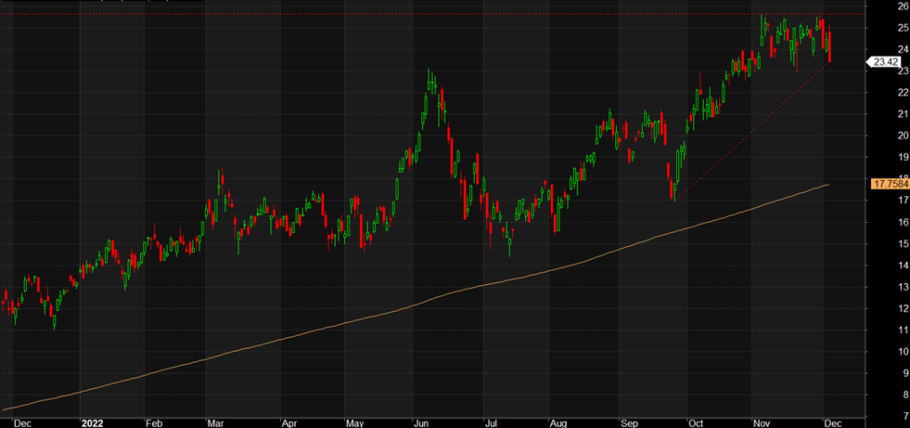
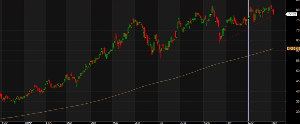
Notice both charts are marked with a red dotted upward sloping trend line. The first chart shows a steeper slope than the second. This says the stock price is appreciating faster in recent times. Looking at the rate of change over the past 50 days (which is the approximate period of the trend line) the first chart has moved up almost 32% while the second chart has achieved a growth of approximately 16%. Faster growth is more attractive, meaning we have found a point of difference between the two charts.
Further, both charts are showing a recent period of resistance to ongoing price rise. The second chart is forming an ascending triangle while the first chart is forming a flag. If either chart breaks out to the upside, it might be considered a buy candidate. The first chart would be preferred based purely on its stronger price appreciation over the past 50 days. Also, both stocks have been in their up trends for more than a year. Are the stocks too late in their uptrends or will they go on with further price appreciation? A breakout from the current sideways movement for either stock will answer that question. Notice both charts are displaying an engulfing red final candle. This is an indication of a downward move.
Both charts shown are up until December 5, 2022 which is when this article was written. The two stocks are ERF.ca and TOU.ca which can be viewed in the Chart feature in Market Alert Pro. It will be interesting to review these stocks again once the chart patterns have matured.

