When a stock price maintains a mimimum level for a period of time, it is said to have met support. When this happens, the low prices of the stock form a roughly horizontal line for several days, weeks or even months. When a stock fails to push past an upper price and moves sideways forming a roughly horizontal line of highs and closes, it is said to have met resistance. Therefore, resistance refers to price meeting a ceiling and support refers to price having met a floor, at least temporarily, as can be seen in the image below. Support and resistance is usually signalled by two or more peaks or troughs at the same price level.

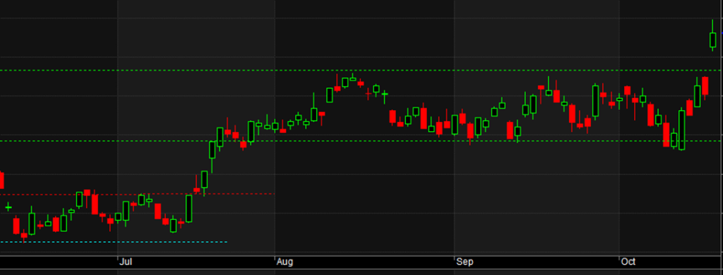
In the image above, the red dotted line shows both support and resistance to the price. The green lines show support and resistance which form a channel. Price eventually breaks out of the channel to form a new high as seen in the final three candles of the chart. The support and resistance lines seen here are user defined, meaning they are subjectively drawn on the chart. These are sometimes referred to as natural support and resistance levels, meaning they are not created by software. It is up to the trader to decide where the support or resitance is valid.

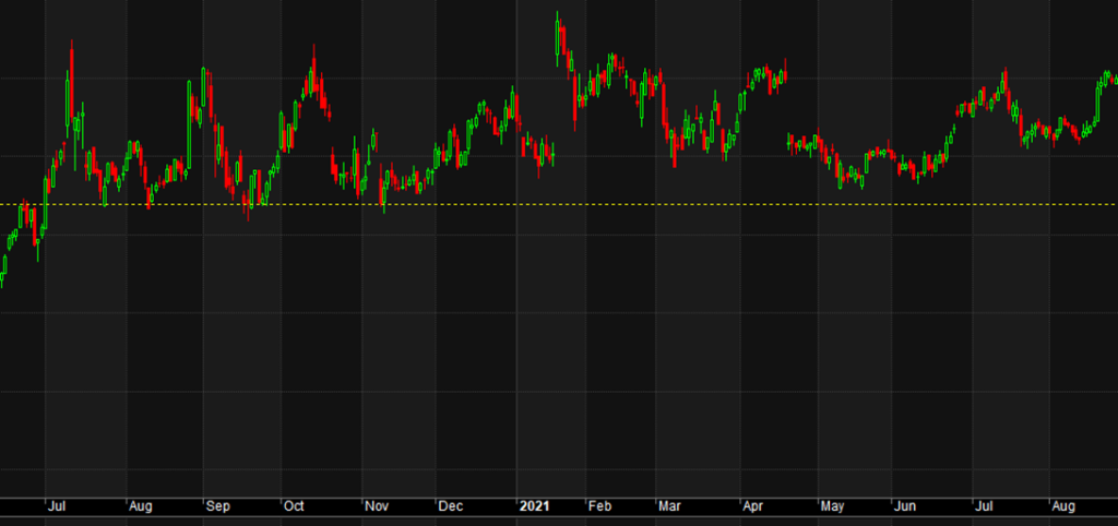
As a general rule the longer the time frame between periods of support, the stronger the level is said to be. When a support or resistance level occurs at all time highs, all time lows or at significant and multiple price levels, it is said to be stronger. Support ocurring at even amounts such as $2.00 or $2.50 etc is also said to be stronger. The yellow dotted line above shows a support level which extended over a period of approximately a year and captured multiple lows demonstrating that the time frame for support or resistance can be longer or shorter, such as the blue line in the above image. The blue line could be extended as seen where it is dashed. Both support and resistance can be seen along the dashed line.
Note that there are charting tools such as Fibonachi and Gann extensions and retracements which will calculate supoport and resistance levels automatically. Whichever you prefer, the important point to understand is that past support can become future resistance, while past resistance can become future support.
Look at the examples of this in the chart below.

Above we see resistance at the yellow dotted line on the left side of the chart which became support at the dip between the two peaks at the centre of the chart. Also, the red dotted line formed support on the left side of the chart and then became resistance on the right side of the chart.
It is important to understand that drawing subjective freehand support and resistance lines is not an exact science. As a trader or investor, you must decide where to place the lines.
To make use of support and resitance lines for trade entry or exits, we would want to see a stock find resistance at a price level and then break through it to close higher. Likewise a trade exit rule might be that price breaks through a prior support level to close lower.

In the image above, the stock stayed within a channel of suport and resistance before eventually breaking out to the upside. This could be used as a buy signal. The trader must decide if the breakout needs to close above the resitance line or simply trade above it. Of course, other rules such as money management and liquidity rules etc would be part of a complete trading strategy. However, the break above a resistance level provides a trigger to begin the process of evaluating the trade opportunity.
Notice also that the stock traded in an earlier channel (red and blue dotted lines) before moving higher. This too provides additional information showing the buyers have pushed price higher. The assumption here being that the pattern may repeat. As can be seen in the first image in this article, the stock continued its upward trend.


