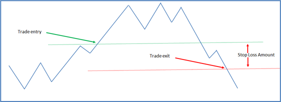
In another earlier blog article titled “Stop Losses and Exit Strategies” it was stated that a small (10% or less) stop loss can cause multiple small trading losses because a stock may have regular oscillations that exceed the stop amount. That is true, but it is only part of the story. Firstly, it is important to emphasise that capital protection in all trades is very important. However, the use of a small (10%) stop loss requires a high level of confidence that the stock price will not fall by 10% soon after the trade is opened.

To achieve this confidence, means having a trading strategy that has been back tested and found to be profitable with, for example, a 10% stop loss. Back testing will show how many times a 10% stop loss is triggered, and in hindsight, the trader can review trades to see if a larger stop loss or an alternative capital protection strategy would have produced better results. Back testing need not be highly time consuming but it is important.
Back testing is the process of applying a trading system to historical market data by, as far as is possible, simulating real world trading to see whether or not the trading strategy made money in the past. To do this, a trader writes down the rules of a trading strategy and then (ideally) has another person apply the rules to the market. Doing this is advantageous because it removes the trading system author’s biases from the back testing process.
Each trade should be opened and closed based on clear trading rules that are written down and not changed ad hoc during the back testing. If the strategy passes this test i.e. it is profitable historically, then deploying it in the real market is more likely to show success. There are no guarantees though. In fact, some traders will say the markets are chaotic and never repeat. Therefore, back testing is nonsense. Others accept that there are identifiable patterns within stock charts which more or less repeat over time.
This is where understanding the phases of a market index, or stock chart, becomes important. Reading the growth and decline periods on a chart and understanding if a sideways movement is leading to an increase or a decrease in price can help position a trade. It also assists in setting the stop loss (maximum loss) position or amount. The problem with stop losses arises when a one size fits all approach is relied on. While a 10% stop loss might be appropriate in one market scenario or for one stock, it may be a very poor fit to another market or stock.
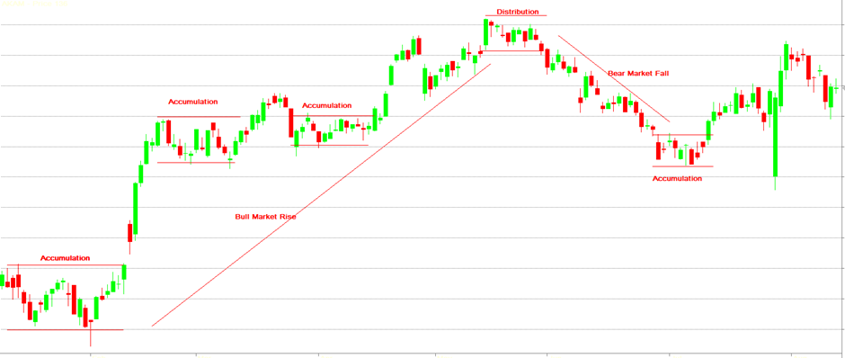
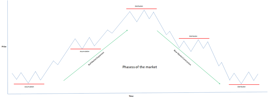
The phases of the market or stock chart are the periods of trending price movement with periods of sideways movement in-between. A stock will often rise, pause for a while and rise again. Or it might rise, pause and then fall. There are thousands of pages written about reading these cycles. We will not attempt to explain them all here. However, the images below show the cycles from a theoretical and real world perspective. The phases can be a little challenging to identify on a real world chart. The ideal model diagrams used here oversimplify the phases, but they do provide a basis to apply the theory to the real world.

The chart above shows a real world example of the phases of the market, with the ideal model seen below. Accumulation and distribution are periods where fund managers and other institutional investors have reduced or stopped their trading. These are periods of sideways movement which slow the trend. Understanding the cycles and other price patterns assists a trader to position trade entries and exits.

There is no attempt to provide an in-depth lesson on price patterns or trend analysis. The point is to be aware that some traders see the above as observable patterns which can be used to time trading activities. We strongly recommend more reading and learning before trying to implement trades based on accumulation and distribution patterns. However, the image above does provide the theoretical framework for understanding that markets move in cycles. The aim is to not get caught at the top.


