Traders entering a stock trade are faced with deciding on how much capital to put at risk. The ultimate danger is that the stock falls to zero dollars. While that is unlikely, stocks can be subject to trading halts, suspension, or even delisting, which can amount to the same thing as the price falling to zero. More likely, is the possibility that the trader’s stock analysis is at odds with the price going forward, or in other words, the price falls instead of rising after a long position is taken. Whatever the cause of the price fall, the wise stock trader will protect capital using some form of protective trade exit. Typically this takes the form of a fixed stop loss or a trailing stop.
Regardless of the method used, it is necessary to be realistic about the quantum of a stock that is likely to move. For instance, if a stock has oscillated regularly by around 12%, then a stop loss of 15% is more likely to keep the trade open than a stop loss set at 10%. This suggests a trader can benefit from analyzing the stock’s personality and setting trading goals that align with that personality. Personality means price and volume performance in the most recent three months, six months, and years.
In setting a stop loss, a trader must understand that if a stock price falls by 10%, it must rise by 11% to return to the starting price before the fall. Using the same math, if a stock falls by 50%, it must rise by 100% to return to the starting price. If a stock is in an established up trend and oscillates by a regular and similar amount, say 8%, then the trader can conclude that for every 8% the stock falls, it climbs by a more significant percentage. This must be true. Otherwise, the stock would be in a downtrend, or at best, and it would be moving sideways.
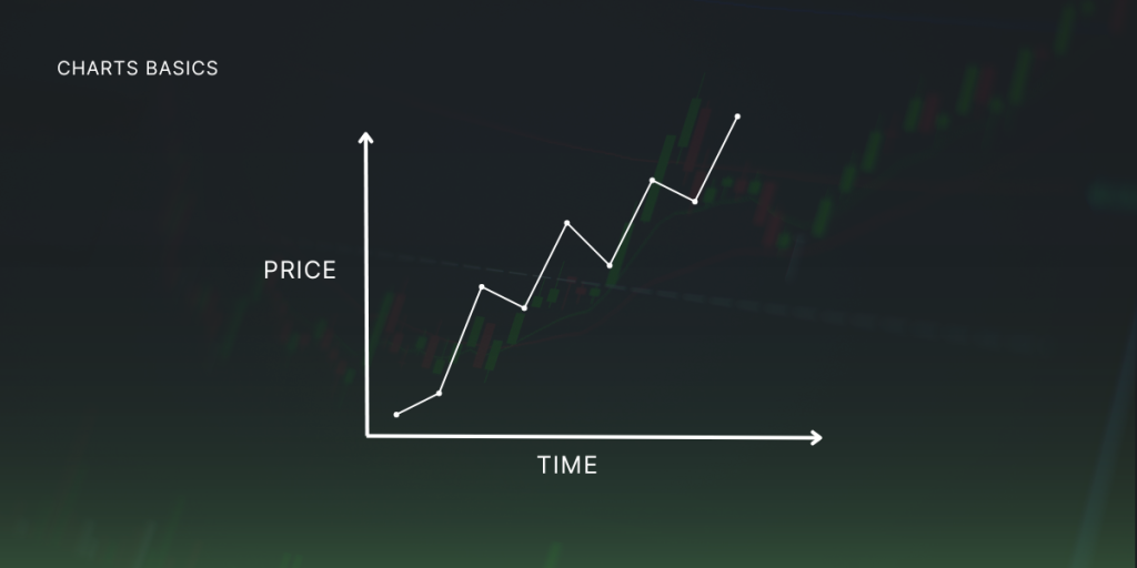
Let’s look at an example of a perfect stock chart. Real World charts are likely to look different from the example below. However, the aim is to look for stocks that conform to the theory as closely as possible.

The chart shows a fictitious stock in an established uptrend. It has risen four times and fallen back four times. If the rises are 12% and the falls are 8%, we can say the stock regularly rises more than it falls. We have a 48% total rise and a 32% total fall. The point is to look for stocks with a habit of oscillating in a way that will not trigger a stop loss set at something more than 8%. In the real world, charts do some incredible acrobatics. Quality stocks can climb and fall seemingly without rhyme or reason. And it is impossible to know what the traders behind the moves were thinking. Was the cause of some news in the media a global economic event or perhaps a natural disaster?
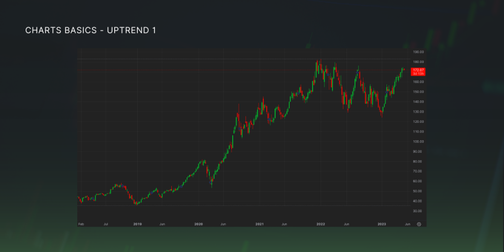
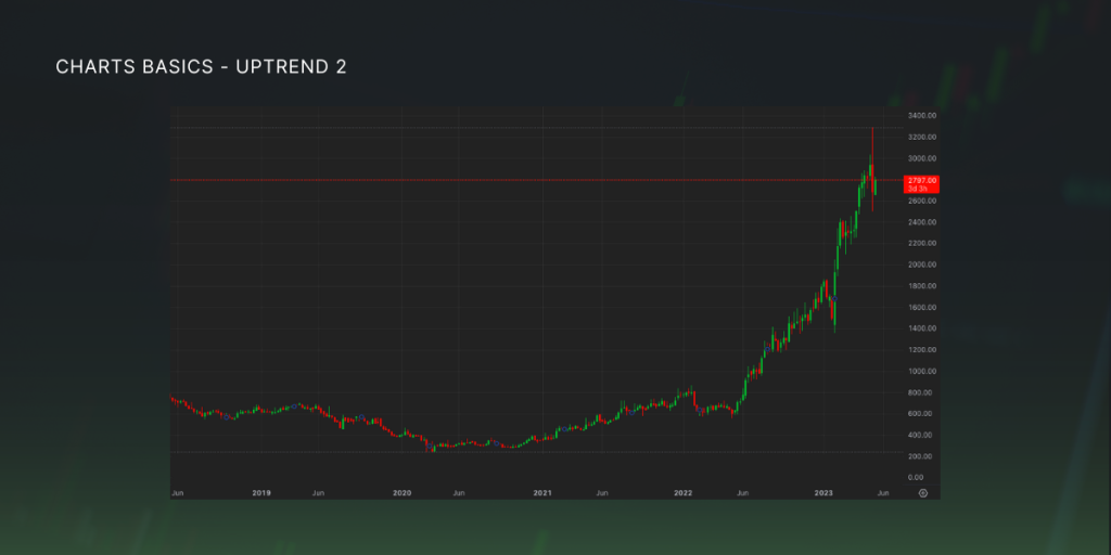
Ultimately, it does not matter. It is up to each trader to look at a stock chart and note that if it has one or more substantial moves within an otherwise stable uptrend, which is to say it won’t have more? We can’t see the future, but we can stack the odds in our favor by selecting trades with the very best chart profile rather than being drawn into a highly volatile chart and having a trade stopped prematurely because the personality of the chart needed to be considered. The best chart profile shows a sustainable uptrend with minimal and consistent oscillations. Both charts below show an uptrend but with fluctuations of 18-22%


The higher percentage difference between the total up and down moves provides insight into the stock’s personality. In the perfect example above, we saw 4 x 8% down movements. If that had been 3 x 4% down moves and 1 x 20% down moves, the trader would need to consider the size of their stop loss or trailing stop. Taking this thought one step further, the smaller the difference between the largest and smallest short-term downtrend indicates a less volatile stock.
Stocks rarely exhibit the perfect staircase trend, but some are better than others. The stock with the most significant percentage price rise may or may not be the best choice. A trader may benefit from learning about a stock by studying its chart and noting its percentage swings compared to other stocks being considered. When the price is considered, what appears to be a small chart swing may actually be a giant percentage swing or vice versa.
The above comments are aimed at traders. Investors looking at the above stocks would have a different mindset. Both charts would be attractive for a long-term investor, but a longer time frame would need to be used better to understand the stock’s long-term capital gain potential.


