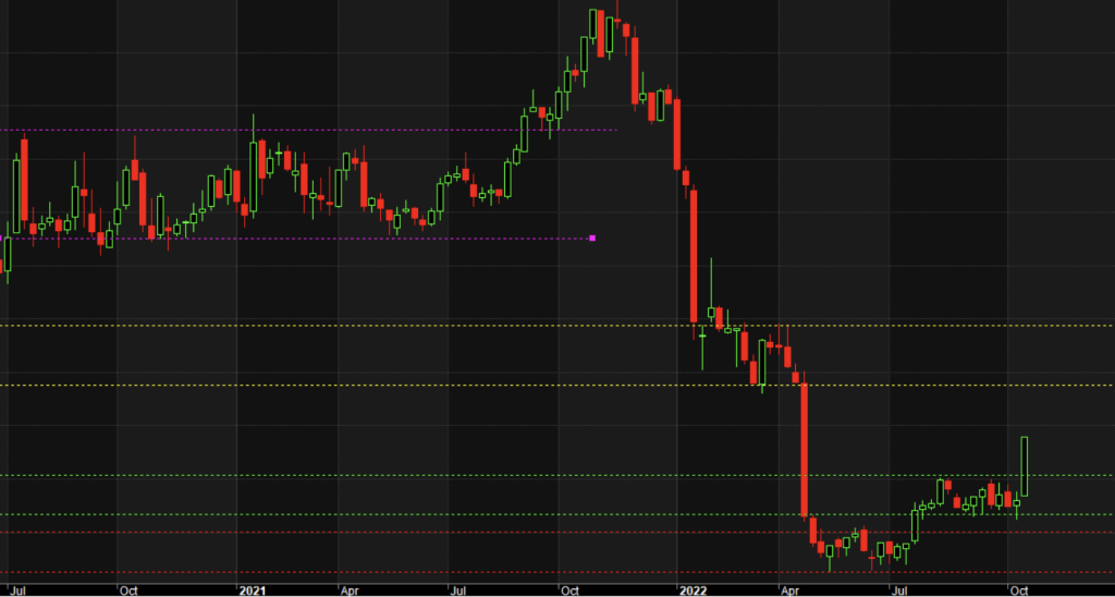
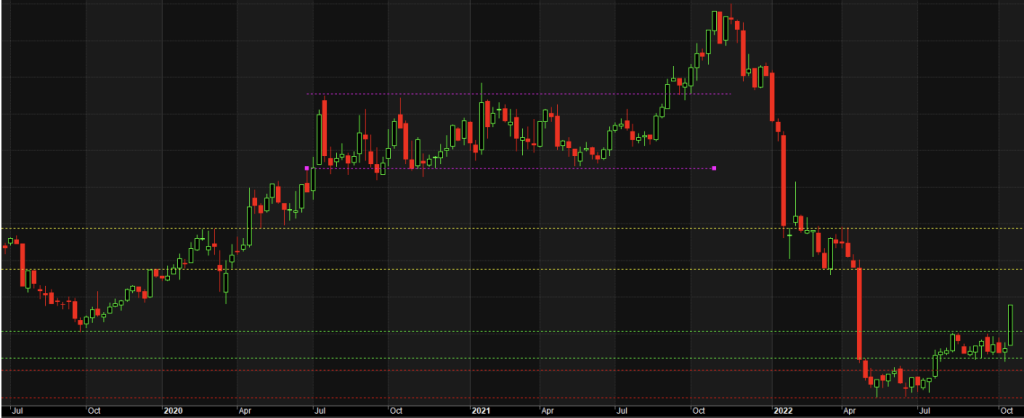
Accumulation is a period on a stock chart when the price pauses an upward movement during an uptrend and moves sideways for a period of time. At some point, the price then breaks out either to continue the uptrend or reverse and form a new downtrend. In the image below (Netflix weekly chart), and looking at the pink dotted lines, we can see the stock had a lengthy period of accumulation before continuing its upward trend for several weeks. The stock then went into a sell-off from its all-time high. During this time, we can see a period of distribution between the yellow dotted lines. Distribution is a sideways move in a downtrend where the sellers have lost commitment to the trend or some buyers looking for a discount have entered the market. These buyers have made a mistake, though, as the stock has broken its uptrend and is in a strong downtrend. There is an earlier and shorter distribution above the distribution marked in yellow.

Between the red dotted lines, the stock underwent what turned out to be an accumulation phase before rising to the green dotted lines and undergoing a second period of accumulation. Finally, the stock price broke out to the upside at the tall green and very last candle on the chart. This was a strong buy signal. When a stock breaks out of an accumulation after falling dramatically, traders and investors have an opportunity to ride the new upward momentum. A similar opportunity arose when the price broke out above the upper pink dotted line before the all-time high in the image. However, that upward movement was less likely to be sustained as the breakout occurred after multiple accumulations meaning the move was late in the trend. How do we know it was late in the trend?

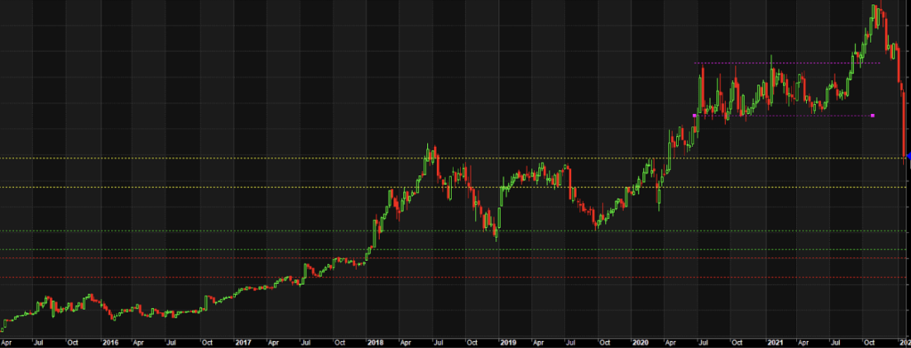
Looking at the chart below, we can see a long uptrend with several new highs and multiple accumulation phases. The stock underwent a lengthy accumulation late in the trend, as highlighted by the pink dotted lines. Often a reversal occurs after a third or higher accumulation.

What drives accumulation and distribution? Obviously, we can’t know exactly who is trading stock. However, if the price is rising steadily, we do know there are more buyers than sellers. When the price rise pauses and the price moves sideways, we can say some buyers have lost commitment to the trend, and there is an equilibrium between buyers and sellers. At some point, though, the price must move out of the sideways channel. Waiting for this to happen is smart trading. Understanding the age of the trend is even smarter.
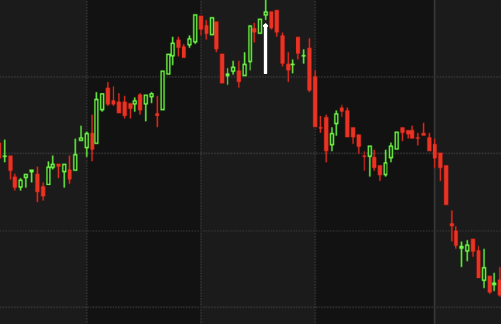
When a stock has undergone multiple accumulations and is rising above its all-time high, the end of the trend is drawing closer. We can’t know exactly when it will come, but we can be prepared for the eventuality. The key is to be aware that uneducated traders will often jump on board a stock trend late in the game. Too often, this is the last gasp period for the stock, and when the stock peaks, falls and recovers for a short time, these optimistic traders get caught as the stock fails to break its recent highs and falls away. This is shown in the daily view of the chart below. Notice the final green candle at the top of the chart below. It shows a long candle wick and a short green body. This is an indication that the buyers were not committed to pushing the price higher. This candle was followed by a tall red candle that engulfed the prior green candle. This, too, was a reversal signal. This pattern of a stock failing to push higher late in a trend is common.

The stock fell away, forming lower peaks and troughs as it went into a significant downtrend. To protect against losing capital gains in this situation, a trader might tighten exits and be ready to sell late in the trend. Knowing the warning signs is vital to avoid entering a last-gasp trade. In this scenario, support and resistance levels are essential. Support and Resistance Lines are discussed in separate articles. Also, look for articles on candle stick patterns, as these should assist your trade decision-making.


